Research
When Crestone Insurance came to me, they did not have any branding in place. For the previous 4 years, the company had grown by word-of-mouth, but they wanted to boost growth and re-launch with a new look.
Client Background
Crestone Assurance is a family-owned business that cares about their clients and their clients’ way of life. They provide insurance, employee benefits, retirement products and consulting services for large businesses and high-net-worth individuals. Crestone was established in 2013, but founders, Anthony and Michael Marquez, are part of a strong legacy of leadership in the industry — one that began over 60 years ago, and continues to this day.
Project Requirements
Crestone Assurance requires a corporate ID to communicate trustworthiness.
Crestone is in a unique situation because they are a young company, but they have 60 years of accumulated experience among their owners, Anthony and Michael Marquez. They need an identity that expresses that experience.
They want to feel like a legacy company with generations of experience.
Design Process
I wanted to display strength and trust in the logo with a strong mark.
Many of Crestone’s competitors relied on their company name in a logotype solution. In order to set Crestone apart, I decided to shift toward a modern design that would still express the experience and trustworthiness of the business.
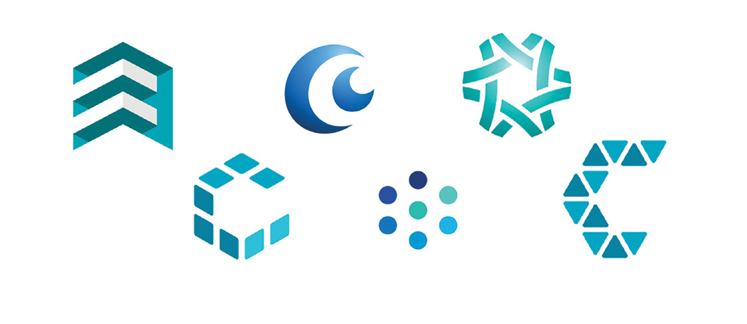
I was inspired by geometric shapes.
Name Decision
When they came to me, the company was called ‘Crestone Insurance.’ However, I made the recommendation to change the name of the company to ‘Crestone Assurance’ to better reflect the values and attitude of the company.
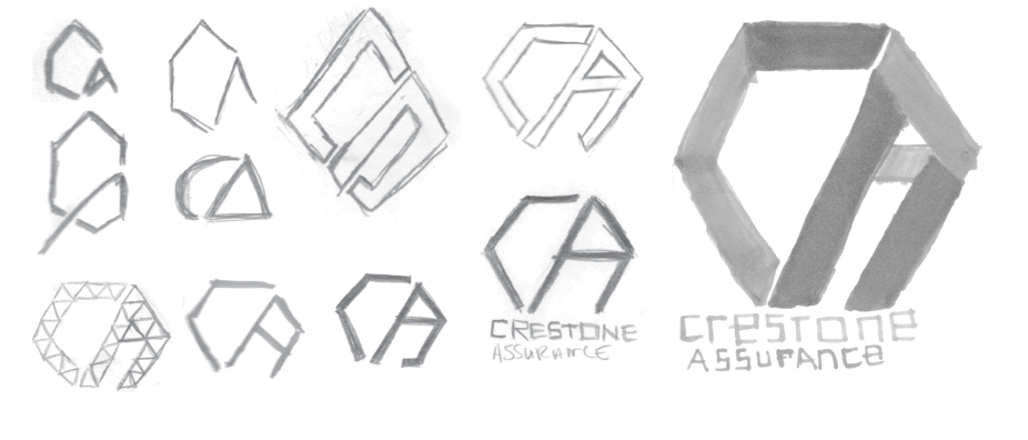
Sketches
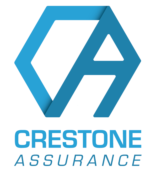
There is a quality of support to this mark that expresses trustworthiness. The “C” and the “A” lean on each other, much like Crestone’s clients can lean on them for support. It is known that the hexagon is one of the most sturdy natural shapes. This is why bees build their hives using hexagons.
The sturdiness of the shape and the way the letters rely on each other combine to form a strong mark for Crestone Assurance.
Final Logo
The final logo design brings all of my concepts to life. On top of using a hexagon to represent stability, the “C” and the “A” lean on each other much like Crestone’s clients can lean on them for support. To match that concept in the mark, the word “Assurance” is italicized as well.
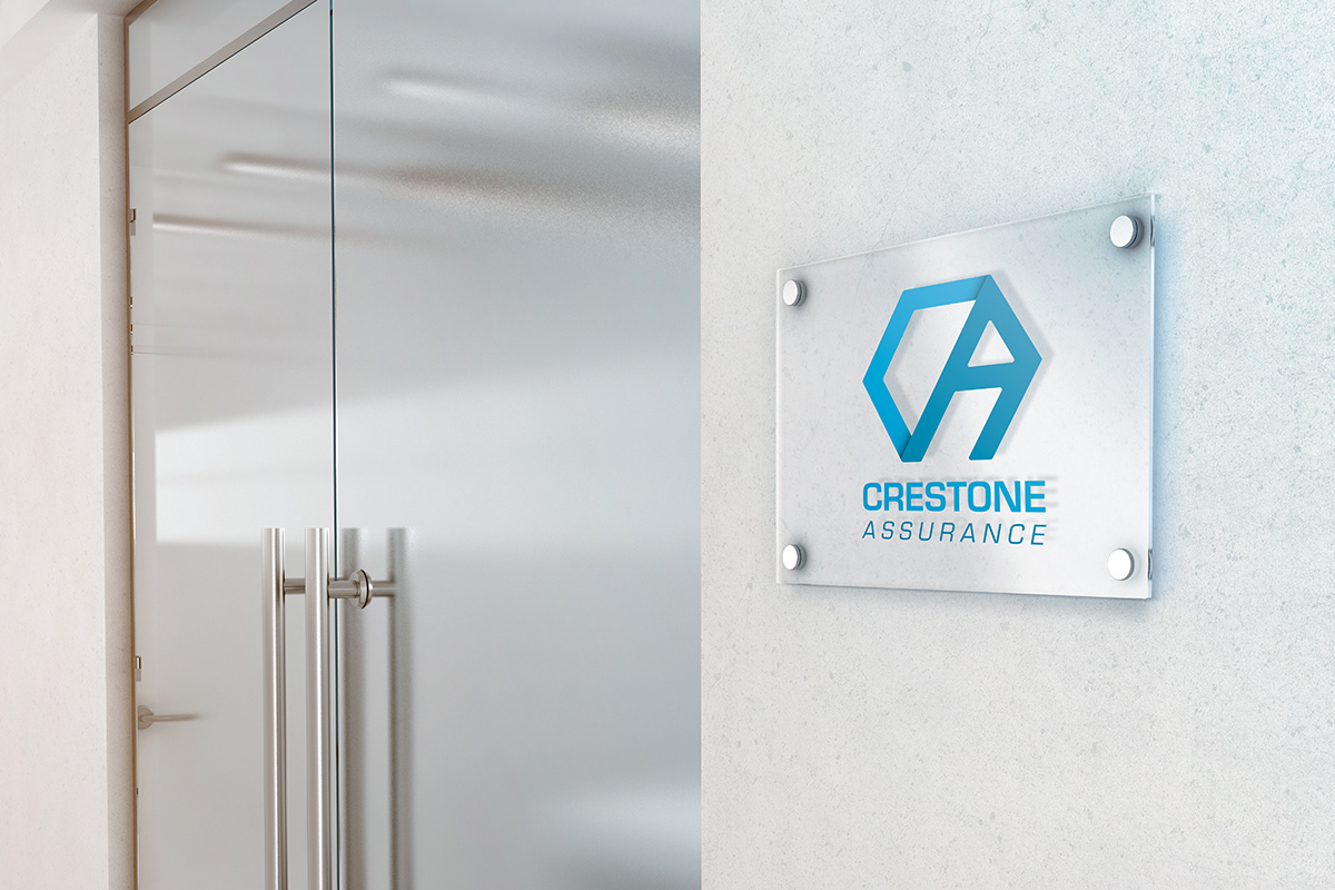
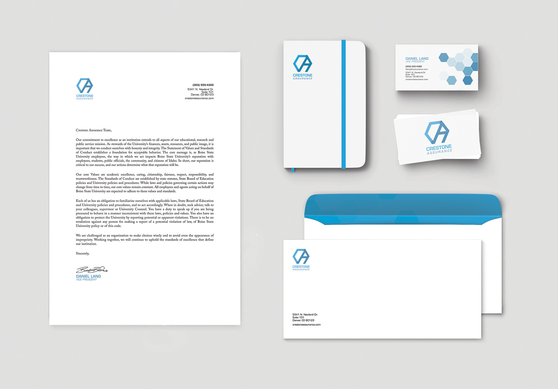
Brand Collateral
I designed the collateral to be simple. All of the pieces incorporate Crestone Assurance’s brand colors, logo and the hexagon element.
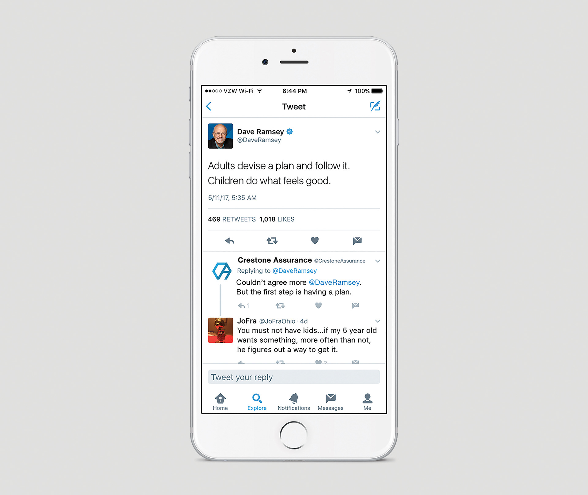
Social Media Strategy
Crestone did not have a large social following, however, there were others in the world who did and their values and advice overlapped with some of Crestone’s. As such, I proposed that Crestone make use of posts by others with larger followings to expose themselves to those followers. By doing this, Crestone can add value to their conversation, while inserting themselves in the conversation being had by potential clients.