To view this information in a presentation format, click here.
For this project, I designed several user tests to discover challenges that users had while interacting with the Contigo brand. I discovered that Contigo could improve their brand name recognition, as well as design a homepage that better reflected their user’s needs, and use different advertising strategies to better reach their audience.
The solutions I designed were to help Contigo improve their overall user experience. More specifically, the solutions were designed to address the two core problems I discovered when user testing: poor brand name recognition and homepage information architecture.
Core Challenges
Poor Brand-Name Recognition
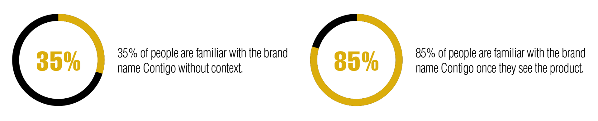
Most people are only aware of the Contigo brand once they see a Contigo product or the Contigo logo. But they are not aware of the brand by simply hearing or reading the brand name.
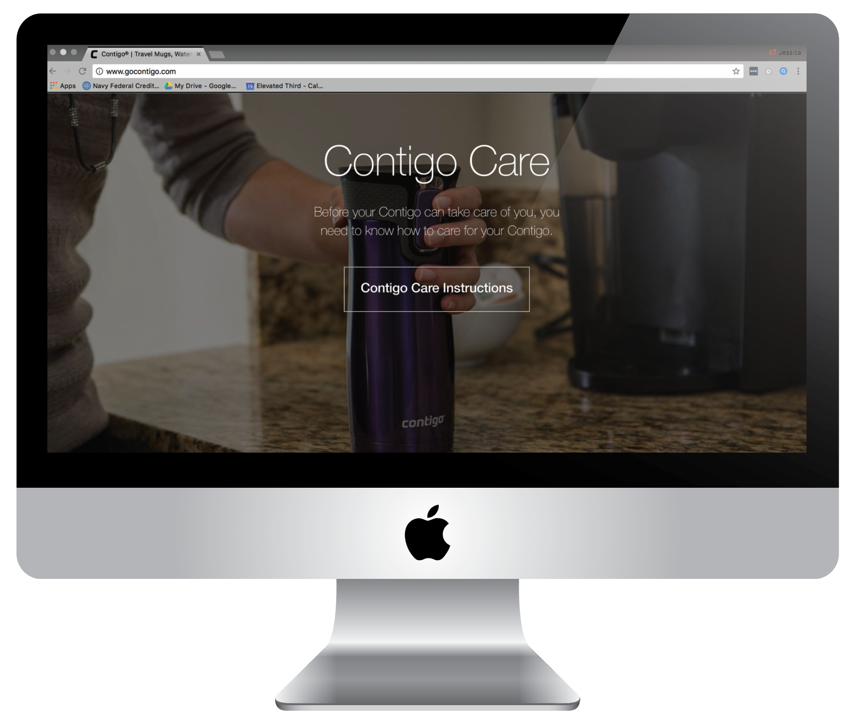
Homepage Does Not Reflect Customer Priorities
The homepage consists of a promotional offer, a large section about product technology, a CTA to learn about Contigo’s process, a CTA to read their blog, social media photos & a CTA to sign up for news & promos. This is not what customers come to Contigo’s website for.
Proposed Solutions
Shareable Social Assets
Brand Personality = Increased Brand Awareness
By creating relatable and humorous branded assets, Contigo can promote their brand and build a personality. Having a personality allows customers to connect to the brand and builds brand-name awareness.
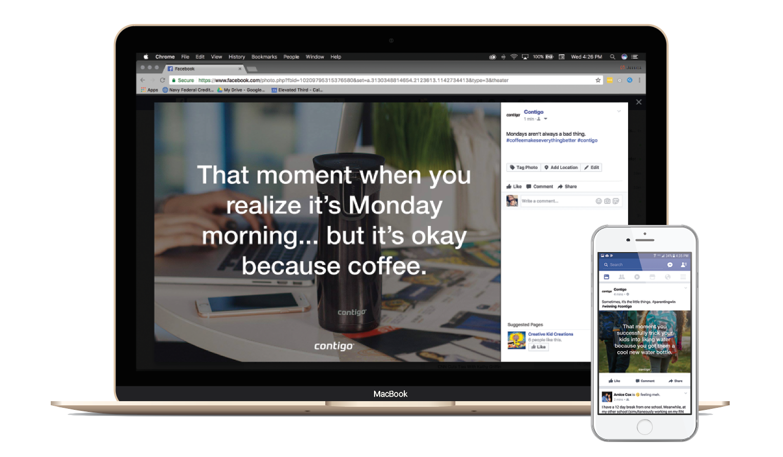
Contigo Facebook memes
Advertise on the Right Platforms
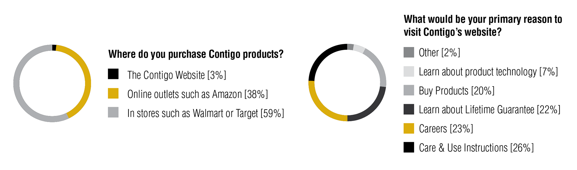
Most people don’t shop on Contigo’s website.
“If you build it, they will come” may have worked for Kevin Costner, but lifestyle items like travel mugs aren’t exactly a web destination. By going where Contigo’s customers naturally spend their time, the brand can not only better reach their audience, they can increase their return on each marketing dollar.
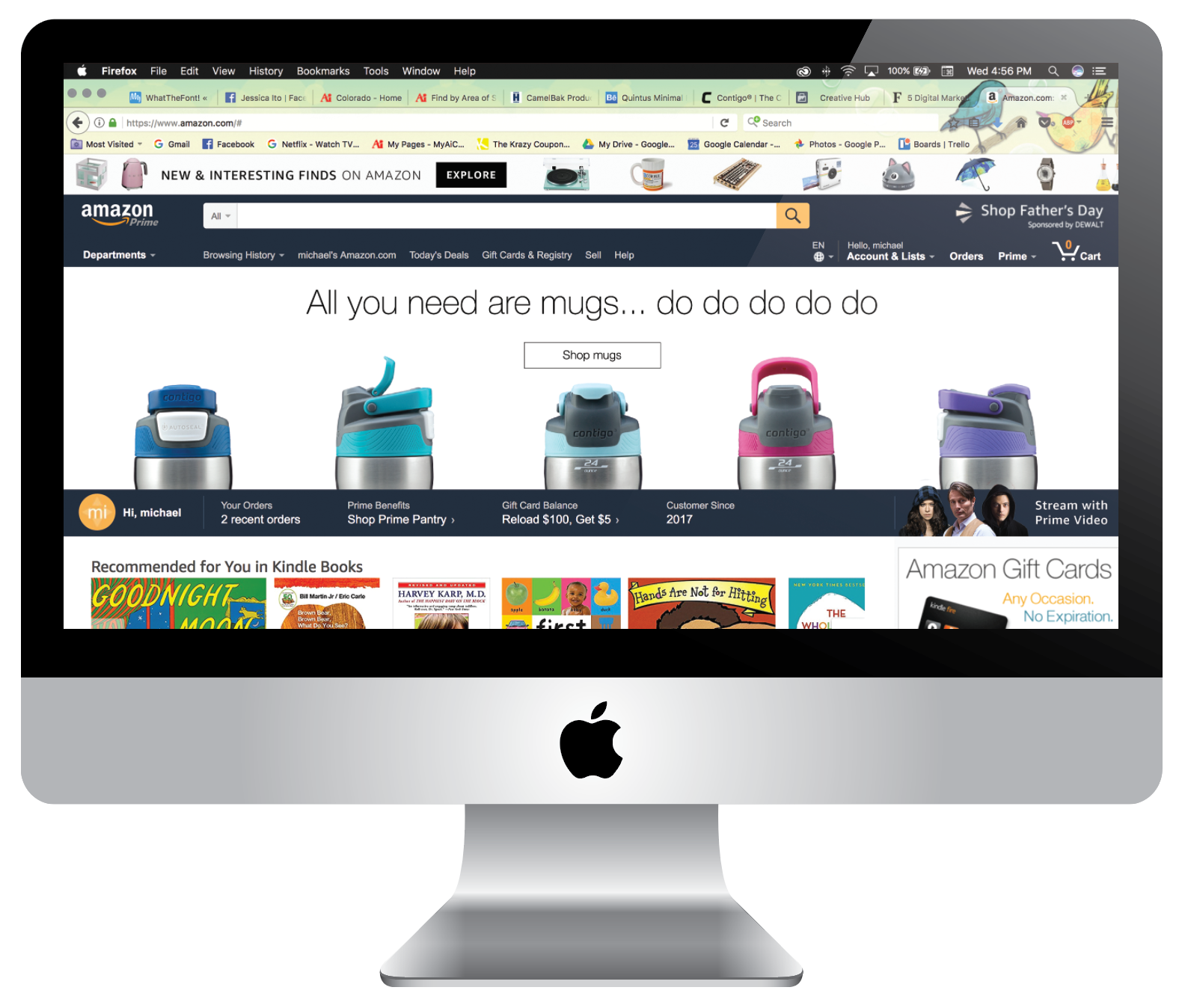
Contigo advertisement on Amazon
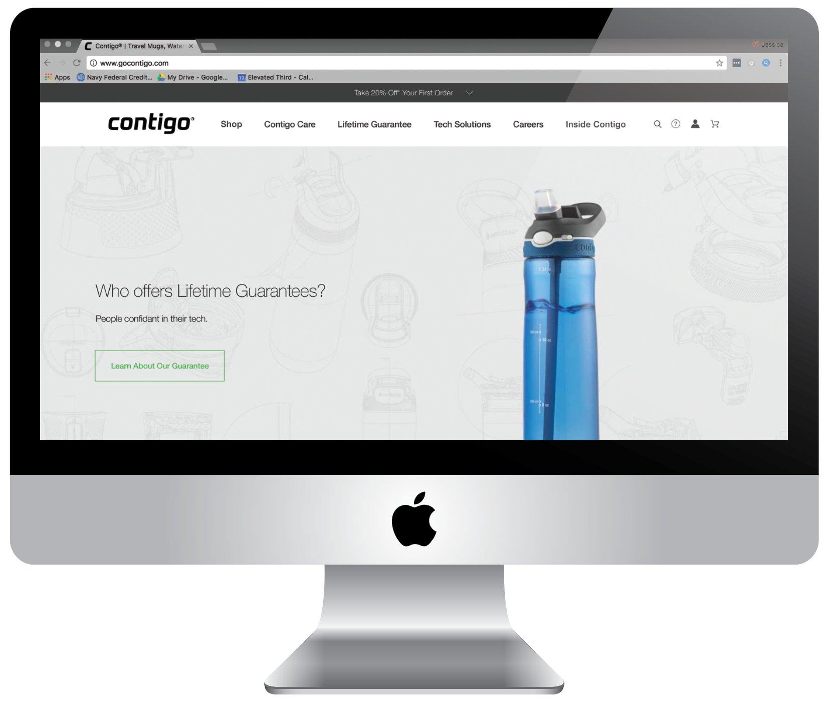
Add Top-Level Menu Items and Implement a Slider.
Currently, Contigo only has two menu items in their main navigation. By expanding the navigation to reveal the most popular menu items, it makes the user experience much more intuitive.
On the current homepage, there is an area for one promotion to be displayed above the fold. This promotion is always for a discount – this may prompt impulse purchases so it is worth keeping. But adding carousel functionality allows for more than one featured piece of content (another place to build the brand and feature the content that people are most interested in).
Expanded navigation design. Currently, Contigo's site only has two navigation items – 'Shop' and 'Inside Contigo.'
More Expanded Navigation Options
Implement the new names into the navigation and give the user the option to shop by product category or product name. Included featured products with photos to entice users to make a purchase.
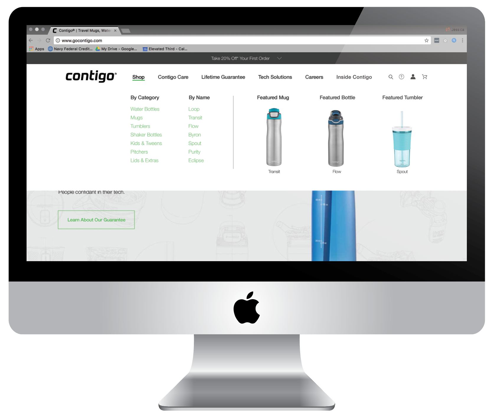
Expanded navigation design
Include an Option to Shop on the Homepage
Currently, the only CTA to make a purchase on the homepage is the promotion on the top of the page. Including a CTA to purchase on the homepage may entice users to make an impulse buy.
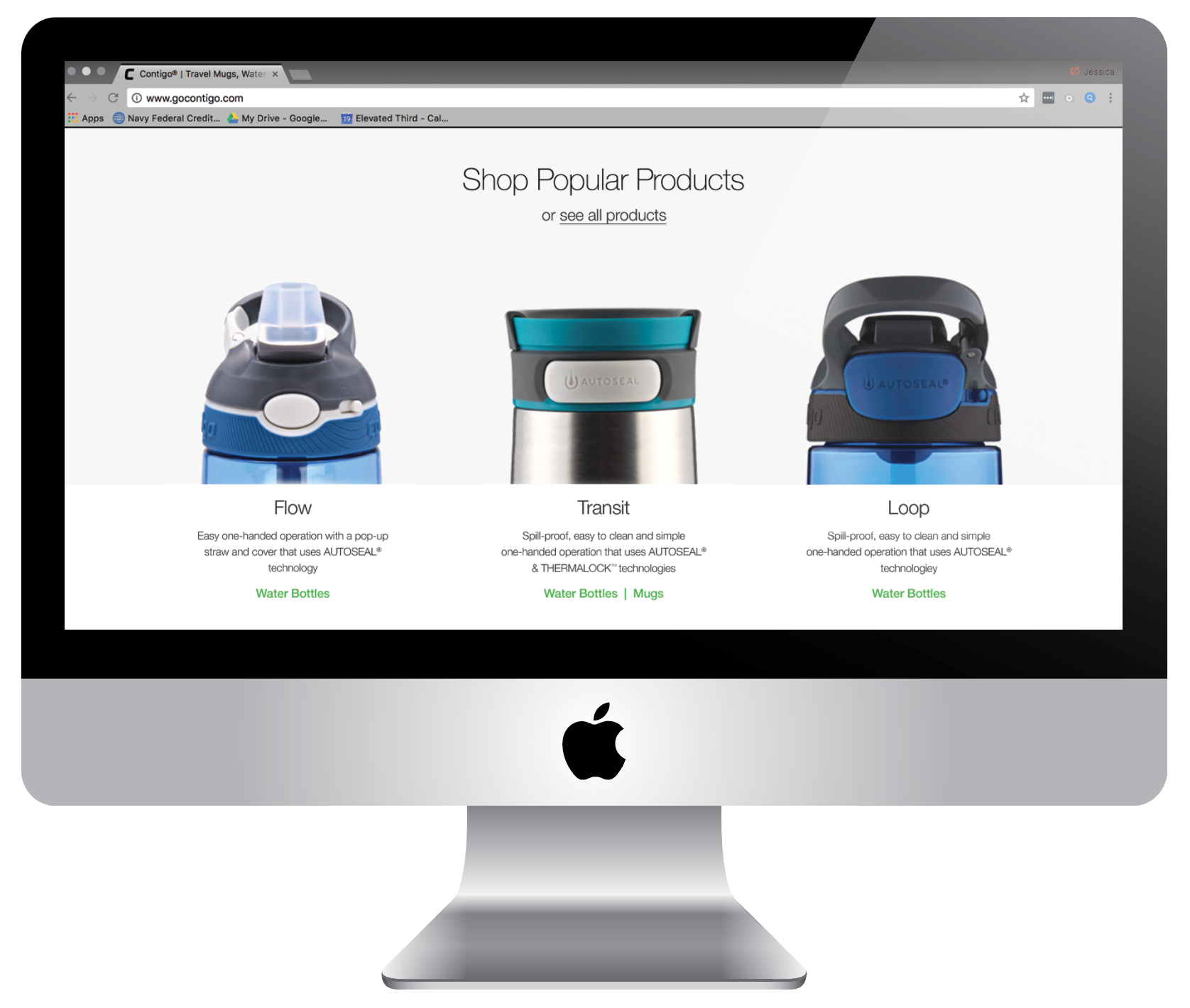
Shop module on homepage
Include More Information That is Relevant to Users
26% of users said the primary reason they would visit Contigo’s website would be to find care and use instructions. Why not make it easy to find?